Pocket Learner App
Pocket Learner is a mobile app that teaches children with learning difficulties to read. The app is the result of a requested adaptation of the Pocket Learner Booklet produced by ACT Training Services.The first step in creating this application was to define precisely the target audience. The App is to be used by children aged from 5 to 7 with many different learning impediments such as autism, Down's syndrome, dyslexia, etc.
Next, broad goals and requirements for the app were set: the app has to teach and test a child's abilities and progress, and is restricted in several ways by the children's conditions. colors should be soft and non-aggressive to prevent over-stimulation of handicapped children, but retain enough contrast for visually impaired children. Heavy use of iconography would benefit the app by making it more visually attractive and therefore more efficiently retain the children’s attention. This would also serve as a universal label of buttons and sections within the app to help guide not-yet-literate children.
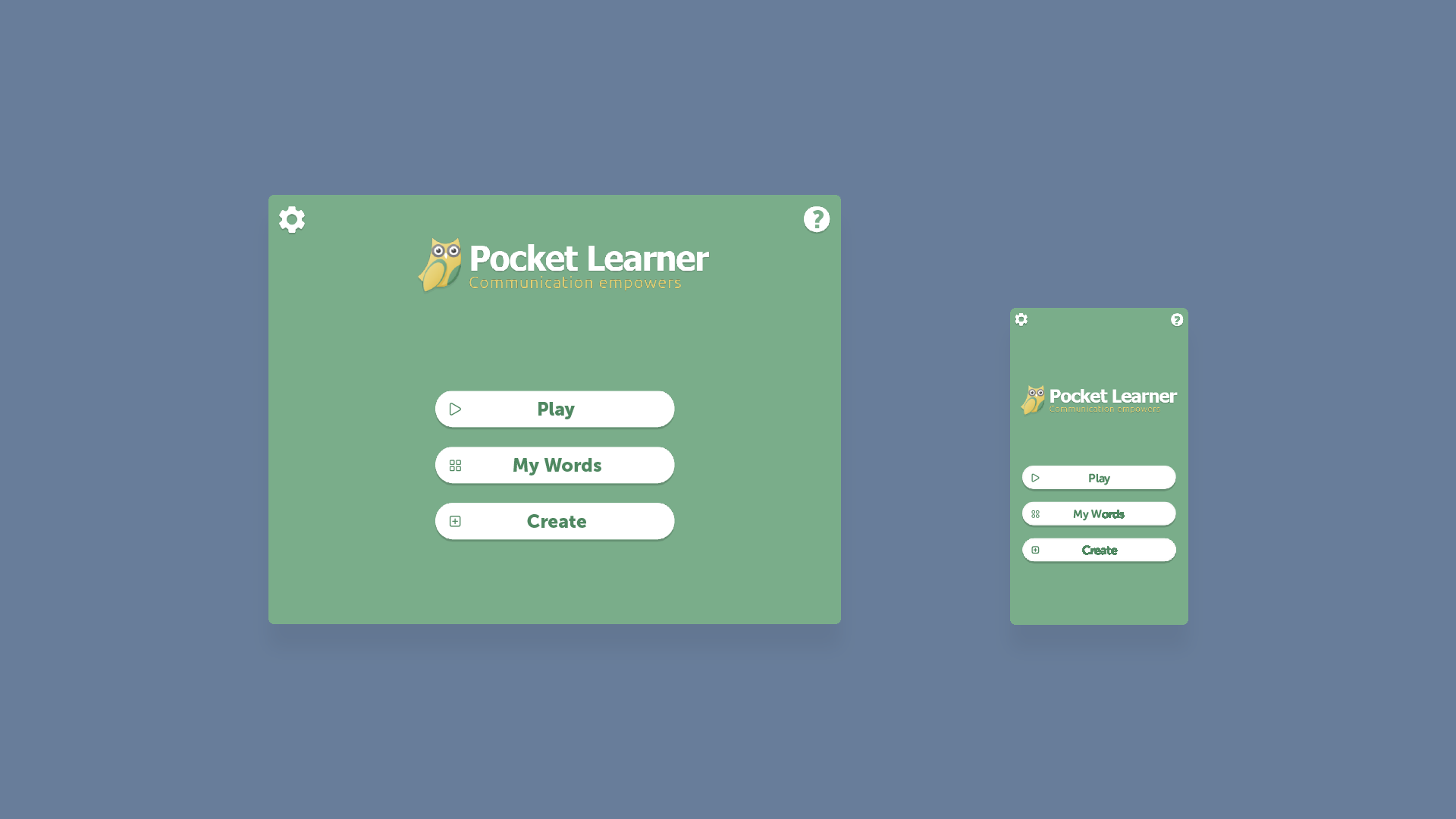
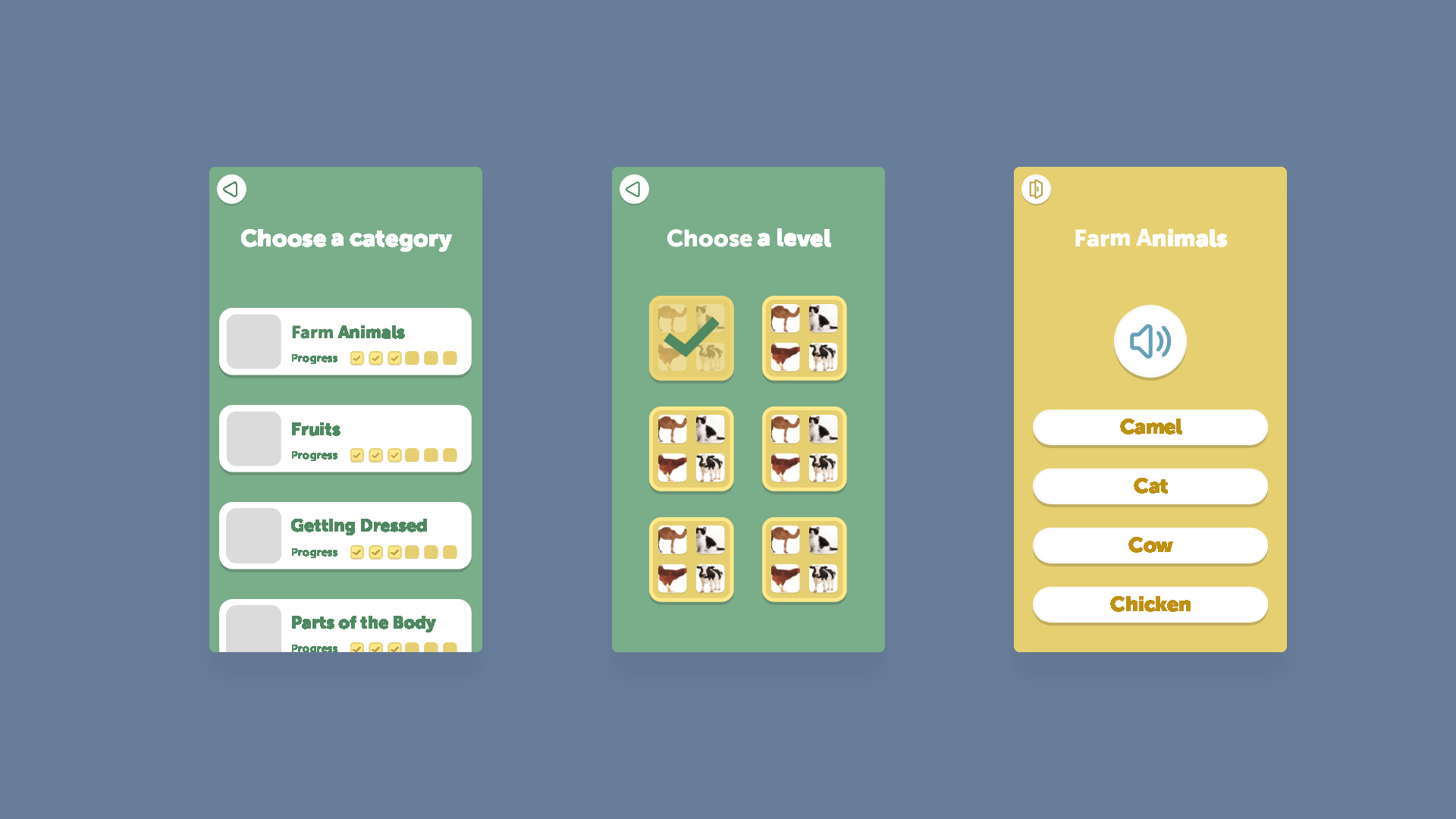
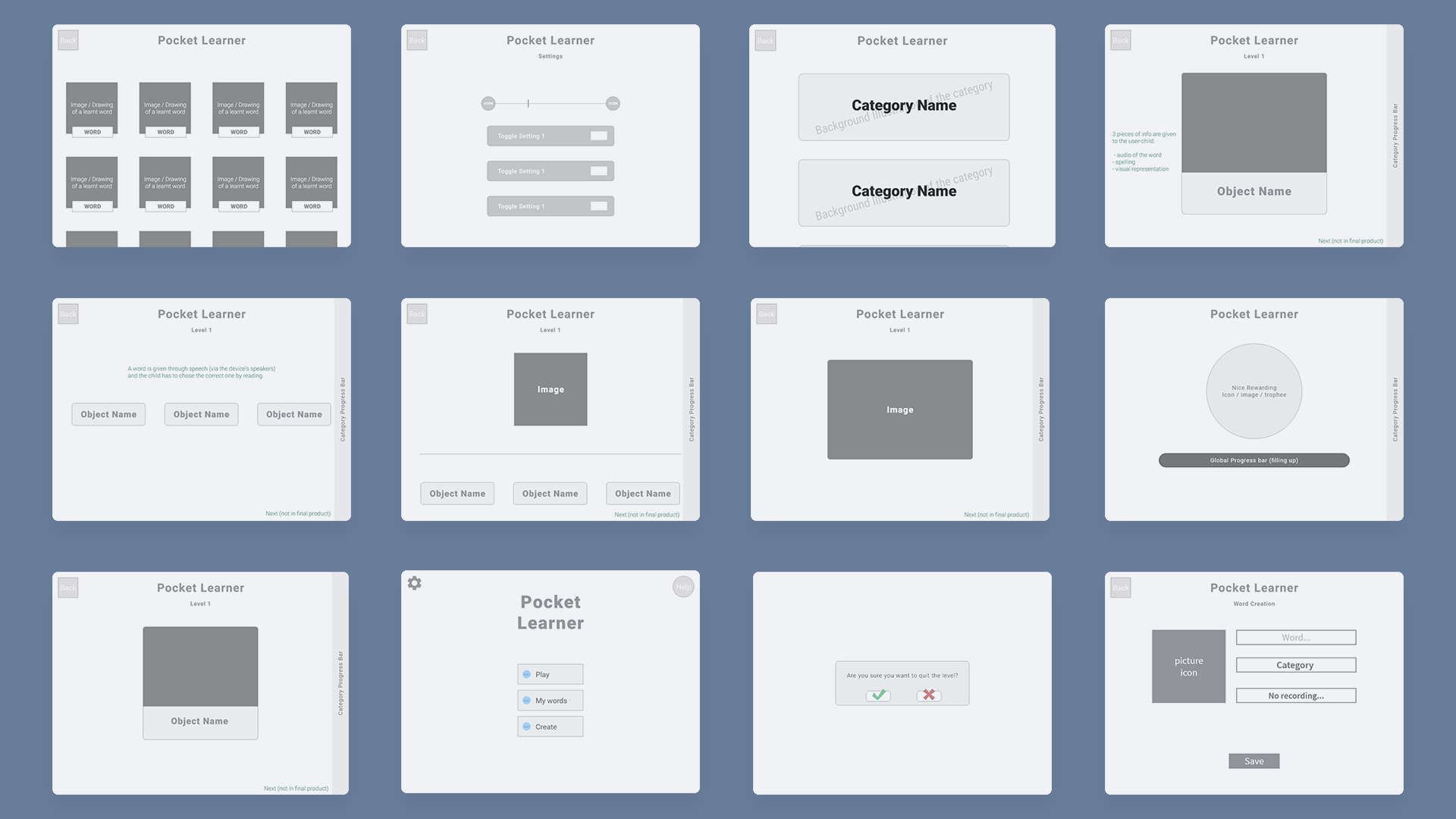
The third phase was to plan out the layout of the elements by sketching a few wireframes. In terms of layout, I wanted to make the app very clear. Some mentally ill children may get confused by odd alignment of elements on screen or similar inconsistencies. Therefore, I made sure to have a visible and consistent structure to the UI: the elements are aligned together in a coherent structure. Every element can be visually delimited and separated from the background or from other elements either by their own background color or by a contour. There is no text floating in empty space without a supporting design structural element.
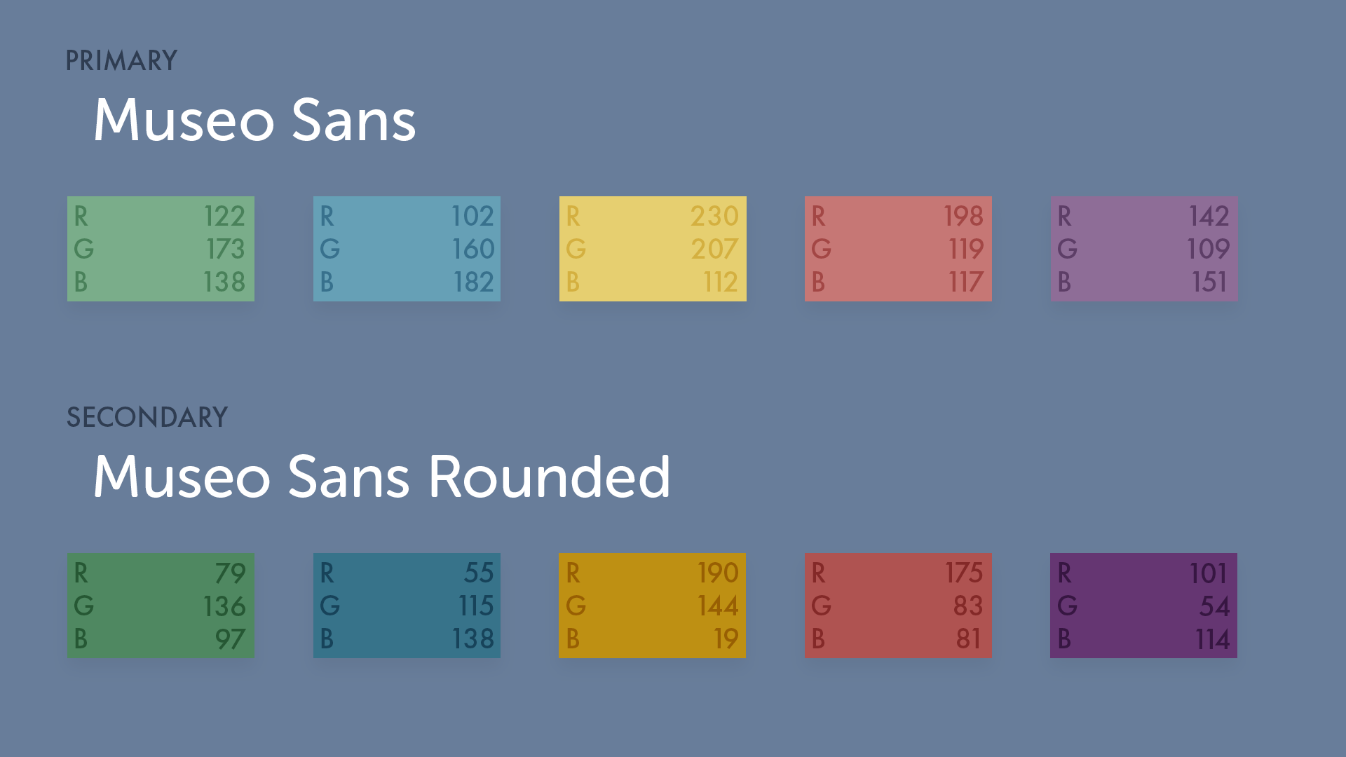
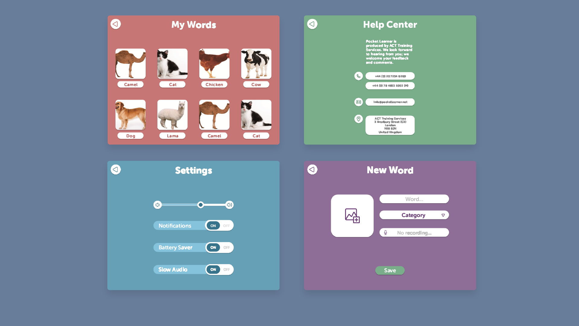
I then moved on to the design of the app. I reused the yellow and green from the original branding and adapted them to the requirements by decreasing their saturation and increasing their brightness so make them softer colors. The type faces in this project were chosen to be clearly readable for visually handicapped children but the font should retain a roundness to its strokes to stay appealing for children. In the end, the fonts selected are Museo Sans and Museo Sans Rounded. To allow unambiguous self-localization within the app, each section is separated with different background colours: green for main menu and game-related screens, blue for settings, red for word collection and purple for custom words.
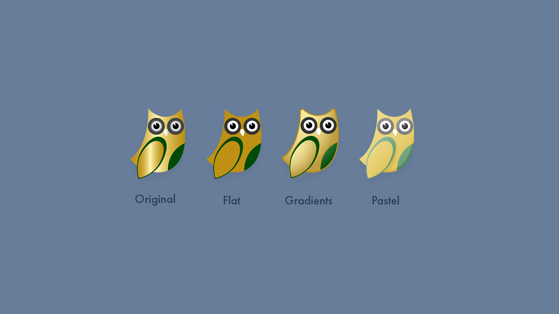
Despite reusing the colors from the original branding, the Pocket Learner logo did not fit in the app. Thus, some iterative changes were done to adapt it to the visual context of the application.
Through out the design process, user testing and regular feedback from the company helped guide the creative and technical decisions.
Online Prototype
- Adobe XD
- Photoshop
- Illustrator
